I use these 10 steps on a daily basis in my editing process. These are guaranteed help you to improve your Lightroom drone photography skills.
If you’d rather read the PDF version, download it for FREE now!
01. HDR merge your AEB shots for more dynamic range
If you’ve read my 10 drone photography tips, you already know how to take AEB photos (Automatic Exposure Bracketing). In short this will take 5 photos instead of just one. 2 will be underexposed to include more details in the highlights (the sky for example) and 2 will be overexposed to include more details in the shadows. Now Lightroom has this handy option to merge those 5 photos together into one HDR photo. It samples the best areas from all 5 photos. Meaning you’ll end up with a photo that has all the detail you want in the highlights and also in the shadows. That’s what they call having a maximal dynamic range.
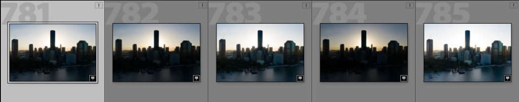
Now how do we do this? Very simple, you select all 5 RAW photos by ctrl + clicking them individually or selecting the first one and then holding ctrl + tapping the right arrow key. This will include the photo on the right into the selection. Do this until all the desired photos are selected (the background will light up grey). Then you right-click anywhere in the selection and chose ‘Photo merge’ – ‘HDR…’. A pop-up will open and Lightroom will take some time to create a preview.
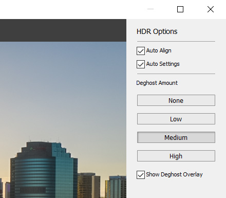
In almost all cases you’ll want to have the Auto-align and Auto-settings checked. Below those are some buttons to play with the ghosting. Imagine a photo where a person or object (like a boat or car) was moving while you took that shot. As those 5 photos were taken at like a millisecond apart, if you line them up, the moving object will not be in the exact same spot. Depending on its speed, it will create a little or a lot of ghosting in your preview. Meaning it will become a little bit see-through, leave a trace or a person might appear to have 4 arms.
You can get rid of this by adjusting the ghosting level. I tend to keep mine on medium. If there is no movement, it will not hurt your image in any way. If there is movement, the medium option will get rid of most of it.
PRO tip: be sure to turn on the ghosting mask (shows as a big red spot on your preview), so you can see which areas are affected. Play around a bit and if you’re happy, click on the ‘merge’ button.
02. Crop your photo for that perfect composition
Now the next step in my workflow is usually to look at the overall composition. Click on the square box icon in the right menu (be sure you’re in the ‘Develop’ panel in the top menu) to activate the ‘Crop overlay’ tool. A new workspace will open and you’ll have the option to manually re-crop your image or use one of the predefined aspect ratios on the right. Depending on where you want to use your image, you can select different aspect ratios. I’ll use the example of Instagram here. The original format for Instagram used to be square (so 1:1 ratio). Nowadays they allow more formats. Generally speaking, I would advise the portrait mode (4:5 ratio) because – as mobile screens are portrait orientated – it allows your photo to take up more screen-space and it looks more pleasing. (also see my Instagram guide for more details)
Once you select this, you’ll see an overlay on your image with the 4:5 format ratio. However, you’ll notice it is still in landscape mode. Click ‘X’ on your keyboard to change the orientation. That’s better right ? I always have my third-gridlines activated as well. To toggle to the other gridlines, just click ‘O’. These gridlines can help you crop to the right composition.
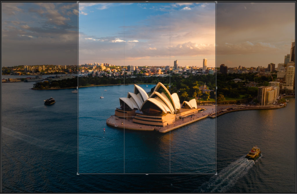
PRO tip: usually less is more in your composition. So sometimes zooming into your image will reveal a much better composition. Less distracting items and more focus on your subject. If you are unsure what to do, try to position your subject or any major lines in your photo onto those third-lines. It will look so much better. A horizon is a good example. Position the horizon onto the top third line to balance the image. Once you’re happy with the composition, hit ‘enter’ on your keyboard and it will take you back to the editing workspace.
03. Use auto settings to stretch your histogram
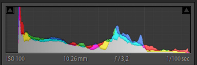
Next step in my workflow is to sort of reset the image to its maximum values. I open the ‘Basic’ panel and click ‘Auto’. This usually does a great job. It will adjust your exposure, lower the highlights and move up the shadows to reveal more details. Look at your histogram while you do this. It will stretch out the histogram all the way to the left and right. The only thing you want to watch out for is clipping. That means when either the highlights (the right part of the histogram) or the shadows (left part of the histogram) will go outside of the little box. That means you’re losing information and you’re either getting over- or underexposed.
Now you can still tweak the auto settings a little bit. When you’re finished, it’s time to look at the ‘Curves’ box right below it.
PRO tip: if you already want to add in some more color here, make sure to not use the Saturation slider as this is too aggressive, but instead use the Vibrance slider. This will increase the contrast between the colors and while you still get more pop, the overall look-and-feel will not seem fake.
04. The S-curve will add back some contrast and depth
Your image is already looking pretty good, but still a bit flat. Let’s add in a basic S-curve for more contrast. Go to the ‘Tone curve’ panel and make sure the RGB channel is selected. Click the little drop-down menu below the graph and select ‘Medium contrast’. You’ll notice right away this really brings out your image and gives it a lot more depth. If you’re feeling lucky, you can try to move some of the points on the curve a bit higher or lower to find the best values.
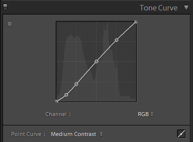
I’ll warn you though, the curves box is very tricky to get right (but very powerful). It’s easy to go overboard here. So, if you’re not sure, just stick to the basic ‘Medium contrast’ settings.
PRO tip: you can also add an S-curve within the red-green-blue graphs in order to affect individual color spaces. However, these are a lot more aggressive than the white. So, make sure to tweak the curve just in minor bits. Reducing the green curve for example, will bring out more of the red-blue hues etc … This can be a great tool for styling as well.
05. HSL panel to bring out those colors
This is where the fun stuff starts ? At least in my opinion, haha. Usually you’ll want to accentuate a certain set of colors in your photo. To make them stand out, you’ll use the HSL panel. It’s a very powerful tool, so definitely follow along here.
HSL stands for Hue-Saturation-Luminance. I usually start with the Hue, move to the Saturation and finish it off with the Luminance, which is kind of synonym for the Brightness of a color.
[s201_bai id=”3″]
Now this all depends on your personal style and preference. I like to accentuate the golden hour colors in my photos. Other people like moody edits. So, for the sake of explaining, I would go to Hue and usually move the oranges a bit more to the left and move the yellows a bit more to the left. This will move that whole orange-yellow spectrum a bit more into the deep orange colors.
A great way to learn this, is by dragging one slider all the way to the left and then all the way to the right. Keep your eyes on the image and see how the color changes (or not, maybe that color is not present). That will get you a good feel of what you can achieve. In most cases you don’t want to move a slider to its extreme. As Nigel Danson always says: “change it ever-so slightly”. He has some great videos on Lightroom btw and his style is really different from mine. But I still learned a lot from him.
Once you’re happy with the color hues, you’ll want to go into the Saturation panel. Again, to achieve my golden hour look, I will significantly boost the oranges and to a minor extend also the yellows. As you’ll notice, boosting the yellows and greens makes it look very artificial very quickly. Play around a bit with the sliders until you’re happy.
PRO tip: only boost 1-2 colors and leave the others more or less neutral. This will pop those particular colors, but you’ll still have a more or less realistic look. If you boost all the colors, your photo will look like it came straight from a cartoon.
The last panel is the Luminance. The reason I finish with this one, is it helps to balance out your image once you’ve added the saturation to certain colors. Personally, I tend to also increase the brightness of my oranges and yellows as if they were hit by the actual sunlight. You might also want to darken certain other colors to add more mood into your image.
Once you’re done with these 3 panels, I suggest turning the HSL-panel on and off to see if you didn’t go overboard 😀 Which can easily happen if you stare down your image for too long. Another trick is to get away from your computer for a few minutes and then come back. Does it still look good? Or is it too much?
06. Split toning is great for some personal style
Split toning adds a specific color to the highlights and another specific color to the shadows. You can use this to define your personal style. A popular way to use it, is to add a light orange color to the highlights (I use the 3rd option from the suggested colors), while adding a light greyish blue to the shadows (I use the 5th and last color suggested there). Now toggle the Split toning panel on and off. It’s more subtle than the HSL panel, right? But it still has an impact on the overall mood of your image. Of course, this is all personal taste. If you think it’s too much, you can also try to lower the Saturation on the chosen color. This is like an intensity slider. Going from 25 to 12 for example, will still apply the same effect, but much more subtle.
[s201_bai id=”4″]
I like to use the Split toning to get even more of a golden hour feeling into my images.
07. Remove some unwanted elements to increase the focus
Next in my workflow is the ‘Spot removal tool’. This really does wonders sometimes. Imagine you have a supercool beach and there is just too much stuff laying around on the beach. And you think it would look so much better without those bags and towels in it. No problem. The Spot removal tool can take care of this.
Select the 2nd tool on the top-right, a circular icon with an arrow. Now use your mouse wheel or scroll with 2 fingers on your notepad to select the right radius. The bag or towel you want to erase should be entirely inside this circle. Now put the feather on 65% and click once onto your towel. Now Lightroom will automatically try to find a spot it can use to replace that towel with. In our example of the beach, it will use a different part of the beach to sample from and cover up your towel with that new part. This usually does a great job.
[s201_bai id=”2″]
PRO tip: if you’re not happy with the auto-selection, click ‘/’ on your keyboard to ask for a different sample. Do this until you get the perfect result. Sometimes it doesn’t work and you have to manually drag the sample spot to a place where you think it might work.
Remember, this takes some trial and error to master. So, start small and gradually get better. As you see from the example above, you can really clean up a lot with this magical eraser. More Spot Removal Tool examples.
08. Use the right sharpening settings
This will be different, depending on which camera was used. But if you’re using the Mavic 2 Pro as well, then you can try to mimic my settings.
PRO tip: an important tool to help you out here, is the ‘shift’ button on your keyboard. If you hold this while you move any of the sliders in this panel, it will jump to a sort of greyscale setting, which makes it a lot easier to focus on what you’re doing.
The first slider you want to tackle is the obvious ‘Sharpness’ slider. Don’t be afraid to push this one a bit further than what you’d initially think. I used to sharpen at around 30-40, now I more often use the 60-70 range actually. Next is the radius slider, you can bump this one a little bit as well. If you hold ‘shift’ you’ll notice that the edges become a bit more defined. I tend to go from the standard 1 to to 1,2 radius. Don’t bother too much with the detail slider. I find the standard settings to work best.
However, the last slider is important as well. This one controls how much of your image you actually sharpen. Usually you’ll want to sharpen the edges, but not the inside of objects. Because then you actually introduce more noise on a surface that does not need sharpening in the first place. Imagine a sailing boat. The inside of the big sail does not really need to be sharpened, right? So, bump this slider up to about 30-40%, again holding ‘shift’ to see the affected areas.
[s201_bai id=”5″]
Now if you do have too much noise – like for a night shot, you can still continue on to the ‘Noise reduction’ slider as well. Watch out here, because if you put it too high, your image will quickly look fake. So, in most cases, between 10-20 is a safe range. Only use this if you actually see a lot of noise everywhere. I don’t bother with the other sliders here; they don’t seem to do much in my opinion.
09. Add 3 graduated filters for the finishing touches
Take a step back and look at your image. I bet it’s already day and night compared to where we started ? For the finishing touches, I like to apply 3 graduated filters. On the top-right menu, next to the ‘Spot removal tool’ you’ll find another round icon. Click this once and draw a big ellipse onto your image. The edges of the ellipse should almost touch the edges of your image. We’ll use this to create a sort of vignette. This will make the edges darker, so the viewers focus will be focused on the center/subject. For this filter, uncheck the invert box and put the exposure at -0,50. BAM, much better already!
The 2nd one will be a smaller ellipse, which we’ll use to add even more focus to our subject. Put it exactly over your subject (doesn’t have to be in the center of the image at all), check the invert box and add these settings: exposure at +0,30 and dehaze at +0,20. BAM again, look at that subject coming alive.
[s201_bai id=”1″]
Now the 3rd one only applies if there is sun, because we will amplify the sunlight. Zoom out to 1:8 and add a big ellipse somewhere outside of your image (taller than the actual image). Click the invert box and add these settings: temperature at +35 and exposure at +1,00. Now the trick with this one is to position it on the right side of your image. See where your natural light is coming from and put the ellipse so a third of it overlaps your image – on the same side as the actual sun is. This will create the illusion that sun rays are infiltrating your shot.
I really like this effect. Look at the example above, I put it on the right hand side to increase the sun effect.
PRO tip: toggle the overlay on and off with ‘O’ on your keyboard, so you know what areas are affected.
10. Export with the right settings to do right by your masterpiece
So now you have made a killer edit. Great! Sometimes, it still goes wrong at the export phase. I’ll give you some advice – again – for Instagram. Click resize and put 1080p width and 1350p height, resolution at 96dpi (more is only interesting for printing purposes really, where you’ll want 240-300dpi). And limit the file size to 1.500kb.
PRO tip: Last but not least, also add ‘Output Sharpening’ (I use the ‘screen’ with amount set at ‘high’) on export. Try it with and without the sharpening, I think it makes a big difference.
Now you’re ready to export and upload to Instagram. And your image will still look amazing at only a bit more than 1Mb. You’re welcome 😛
I hope you enjoyed these Lightroom drone photography tips. If you did follow along or picked up some great tips, I would love to hear about it in the comments below. Or send me the fresh image through DM on Instagram or even better, tag me in your caption saying you used one of my tips. I’d love to check them out ?
Do you want to take your drone skills to new heights? Do you want to learn how to take those amazing drone photos and cinematic videos? Check out my brand new Drone Adventurer Masterclass!